How to Evaluate Polls, Charts, and Political Data
A Push poll is persuasive campaign communication disguised as research. It typically reaches many people, delivers damaging or suggestive claims, and seeks attitude change rather than a defensible population estimate. A legitimate message test may expose a sample to arguments, collect outcomes, and disclose the design. Purpose, scale, transparency, and actual analysis distinguish the experiment from mass advocacy wearing the appearance of a poll. An Exit poll samples people after they vote. It can estimate how participating groups voted and which issues they report considering. Its design must cover precincts, voting times, early and mail ballots, languages, and refusals. Exit polls are estimates, not official ballot counts, and they describe voters reached by the design rather than nonvoters or all eligible citizens.
A Tracking poll repeats comparable measurements over time. Many use a rolling window: each update adds new interviews and drops the oldest. The smoothing makes a trend easier to see, but adjacent estimates share much of the same data and are not independent daily snapshots. A small one-day move may be chance variation. Changes in mode, wording, likely-voter rules, weights, or respondent composition can create a break that looks like persuasion after a campaign event. Read the design before naming a cause. A movement that follows a debate may be real, but timing alone does not isolate the debate from news, sample turnover, or altered procedures. Comparable repeated measures and uncertainty provide a stronger basis for interpretation.
The mechanism behind how to evaluate polls, charts, and political data
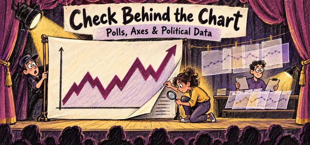
Charts can clarify or distort any of these estimates. Identify the population, field dates, unit, denominator, response category, sample size, and uncertainty before reading the shape. A truncated vertical axis can make a small change look dramatic. A stacked bar can hide movement in middle categories. Line charts imply continuity between observations even when surveys occurred only on selected dates. Percentage points and percent change also differ. A rise from 20 percent to 25 percent is five percentage points and a 25 percent increase relative to the starting value. Net approval subtracts disapproval from approval, so it is not the approval percentage. Subgroup bars based on unequal sample sizes can have very different precision even when drawn with equal width.
How to Evaluate Polls, Charts, and Political Data: key distinctions
An election-night graphic reporting that 62 percent of interviewed voters under thirty supported a candidate. The proper claim is about the exit-poll estimate for participating young voters reached and weighted by that design. It does not describe all young residents, establish youth turnout, or prove that age caused the vote. The official result still comes from counted ballots. Give every specialized poll one plain-language job: push polls seek persuasion, exit polls sample people who voted, and tracking polls estimate change through repeated measurements. Then read the source note and axes. A polished graphic cannot repair weak sampling, and a scientific estimate should not be stretched beyond the population and uncertainty that produced it.
Practice with how to evaluate polls, charts, and political data
Take one current or historical example of how to evaluate polls, charts, and political data, explain the mechanism, and identify the strongest competing principle.
Video lesson: How to Evaluate Polls, Charts, and Political Data
Heimler's History gives a focused explanation of this topic in Evaluating PUBLIC OPINION Data [AP Gov Review, Unit 4 Topic 6].
If the player does not load, watch this lesson directly on YouTube.
Connect this lesson to the larger course
For a broader map connecting how to evaluate polls, charts, and political data to political culture, public opinion, and ideology, use the AP U.S. Government and Politics learning hub.

Related to This Article
More math articles
- Effective Strategies for Learning and Memorizing Math Formulas
- FREE 8th Grade FSA Math Practice Test
- Free Grade 3 English Worksheets for Alaska Students
- Why Do I Need MATLAB Assignments Experts Help and Where One Get It
- How to Use Right-Triangle Trigonometry
- CLEP U.S. History I 109: Sharecropping, Courts, Northern Retreat, and 1877
- Points, Lines, and Rays for 4th Grade
- SAT Math FREE Sample Practice Questions
- Top 10 Tips You MUST Know to Retake the CLEP College Math
- 10 Most Common SAT Math Questions













What people say about "How to Evaluate Polls, Charts, and Political Data"?
No one replied yet.