How to Read Scientific Diagrams, Tables, and Graphs
A line can rise sharply because the measured value changed rapidly or because the graph uses a narrow vertical range. Read the numbers before describing the result. Titles, labels, and units tell you what the shape of a scientific visual can support.
Definition: A scientific visual is a compact argument made from labels, values, units, and patterns. Read the title first, identify what each axis or column represents, note the units and legend, and only then describe the pattern. This order prevents assumptions from replacing the evidence shown.
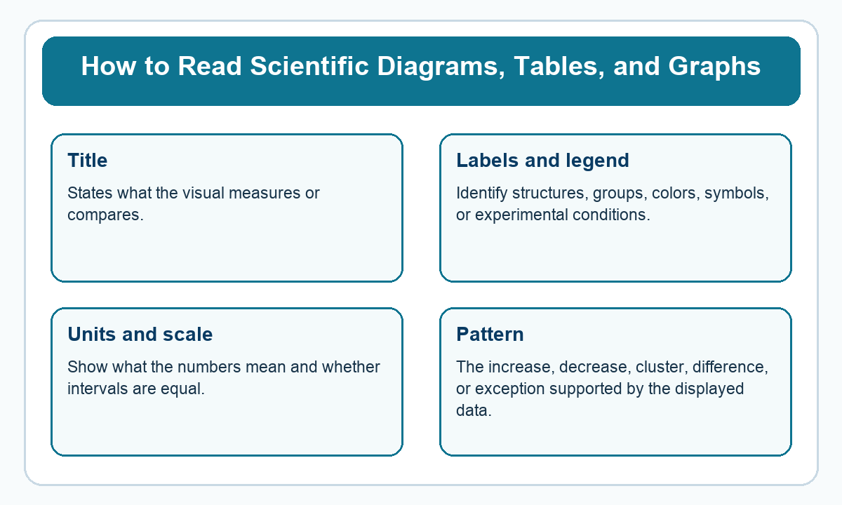
The diagram lists features to inspect before interpreting a visual. Apply them to a graph from your course by naming the measured quantities and reading two actual values.
Terms used in this lesson
| Idea | What it means |
|---|---|
| Title | States what the visual measures or compares. |
| Labels and legend | Identify structures, groups, colors, symbols, or experimental conditions. |
| Units and scale | Show what the numbers mean and whether intervals are equal. |
| Pattern | The increase, decrease, cluster, difference, or exception supported by the displayed data. |
Read the axes before comparing lines
Consider two plants measured at the beginning and end of a week. Plant A rises from 4 cm to 8 cm, and plant B rises from 10 cm to 12 cm. Plant B finishes taller. Plant A gains more height during that week, with an increase of 4 cm compared with 2 cm.
Those are different questions. Final height uses the endpoint, while growth over the interval requires subtracting the starting value. To compare growth rates across unequal intervals, divide each height change by its elapsed time and retain the unit, such as centimeters per day.
Follow the conventions of the visual in front of you
Experimental graphs commonly put the independent variable on the horizontal axis and the measured outcome on the vertical axis. Check the labels anyway. A graph may use another arrangement, and a horizontal time axis does not itself establish that time caused the change.
In a table, find the required row and column before reading their intersection. In a diagram, determine whether an arrow means movement, a sequence of events, or a label pointing to a structure. An arrow toward a cell can mean a substance enters it, but a label line may simply name the membrane.
Describe what the data show
If oxygen concentration falls as water temperature rises, you can report a negative association over the displayed range. Establishing the cause requires information about the experiment and other conditions. Avoid extending the curve far beyond the temperatures that were measured.
A point away from the main cluster deserves attention. Check its label and value before deciding it is a mistake. It might reflect measurement error, a different condition, or real variation. The graph alone may not tell you which explanation is correct.
Check scale and comparison
A vertical axis that starts at 95 can make a change from 98 to 100 look large. The absolute increase remains 2 units. Compare the numerical difference and explain it using the named measurement rather than relying on the height of a bar.
When two graphs use different scales, calculate from their labels separately. A steep-looking line on one plot cannot be compared visually with a line on another plot until you account for the units and intervals. Keep the original values in your written work so you can check the calculation if an answer seems surprising.
Watch a short lesson
The video focuses on graphs, evidence, and data patterns, directly reinforcing the fixed reading routine used in this lesson.
Practice without looking at the answers
Write your responses before opening the answer panels.
-
Plant A grows from 4 cm to 8 cm, while plant B grows from 10 cm to 12 cm in one week. Which gains more height?
Check the answer
Plant A gains 4 cm. Plant B gains 2 cm, although B remains taller at the end.
-
What does a legend tell you?
Check the answer
It identifies the groups or meanings represented by colors, symbols, or line styles.
-
A height change is 6 cm over 3 days. What is the average rate?
Check the answer
The average rate is 2 cm per day, found by dividing 6 cm by 3 days.
-
Why inspect the starting value of a vertical axis?
Check the answer
An axis that begins near the measured values can visually exaggerate a small difference. Reading the numbers reveals the actual size of the change.
-
An observational graph shows two quantities increasing together. Does it establish causation?
Check the answer
No. It shows an association. Other variables or the study design must be considered before making a causal claim.
-
What should you check before treating an arrow in a diagram as material flow?
Check the answer
Read its label and the diagram’s conventions. It may indicate movement, a process sequence, or simply point to a named structure.
Where does this fit in your science review?
The ATI TEAS Science Study Hub places this lesson inside the larger study skills review. Continue with these connected lessons:

Related to This Article
More math articles
- The Best Grade 8 Math Book for New Hampshire Students
- Free Grade 4 English Worksheets for Mississippi Students
- The Ultimate PSAT 8/9 Math Formula Cheat Sheet
- GED Math Flashcards (Free Online: Formulas, Terms & Concepts)
- Best Calculators For 10th Grade Students
- Difference Quotient Calculator (Free)
- Traffic Control, One-Way Workflow, and Ergonomics
- GRE Quantitative Reasoning: 7 Strategies That Actually Work
- Vises and Clamps: Holding Work Safely
- The Best Grade 4 ELA Practice Tests for Delaware Students

















What people say about "How to Read Scientific Diagrams, Tables, and Graphs"?
No one replied yet.