Choice architecture should be judged by evidence and agency
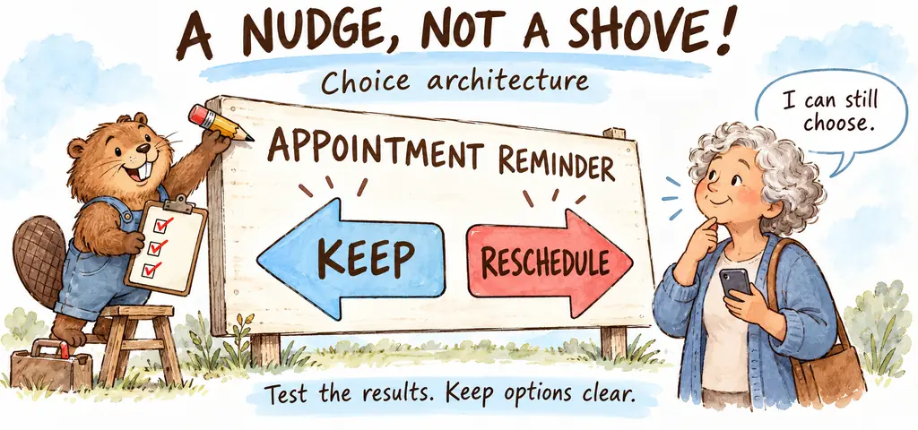
An appointment reminder arrives the evening before a visit. It gives the time and address along with a clear way to reschedule, making the appointment easier to remember while leaving the decision with the patient.
This is choice architecture. The arrangement of a decision environment includes form layouts, defaults and the order of options, and a nudge changes that arrangement without removing options or substantially changing financial incentives.
Find out where people get stuck
People abandon a benefits application halfway through a page of repeated questions. Why do they stop? Simplifying that page may reduce effort, whereas a reminder could do little for someone who remembers the application but cannot understand its eligibility language.
Observe the obstacle before choosing a remedy. Ask which instruction is confusing and test whether a clearer version helps, allowing for the possibility that the designer's initial explanation of the problem was wrong.
A default deserves its own check. Automatic enrollment with an easy opt-out can reduce administrative effort, but the selected contribution level or service matters too, so increased enrollment alone cannot establish that people are better off.
Measure the consequences that matter
A redesign increases completed applications. If errors increase as well, counting submissions alone would hide a cost of the new form that the people responsible for it need to investigate.
Reminders may reach different groups unevenly. A text message can reduce missed appointments among people with reliable phone access while leaving out others, creating a reason to examine both who benefits and who was included in the evaluation.
Randomized comparisons can help identify effects where feasible. Track outcomes tied to the goal and check differences across groups, rather than allowing short-term clicks to stand in for understanding or lasting benefit. Privacy still needs protection. Collect only necessary information, and consider whether withholding an established benefit from a comparison group would be acceptable before deciding how to test the change.
Make refusal practical
An enrollment button is easy to find. The cancellation route is hidden behind several confusing screens, so an option that technically remains available may be costly for a user to exercise.
Examine what happens after inaction. People need to understand the default and its consequences, find alternatives and change their selection without an unreasonable burden, especially when the designer benefits from a choice that may not suit them.
Return to the appointment reminder. Check attendance and successful rescheduling, then consider whether the message reveals sensitive details on a shared phone or reaches someone who did not agree to receive it.
Watch the idea in action
A related lesson from tutor2u. Read the examples above alongside the video.

Reza is an experienced Math instructor and a test-prep expert who has been tutoring students since 2008. He has helped many students raise their standardized test scores--and attend the colleges of their dreams. He works with students individually and in group settings, he tutors both live and online Math courses and the Math portion of standardized tests. He provides an individualized custom learning plan and the personalized attention that makes a difference in how students view math.
Related to This Article
More math articles
- Nevada SBAC Grade 8 Math Free Worksheets: 72 Free PDF Worksheets with Step-by-Step Answer Keys
- Controlled Variables and the Control Group
- How to Graph Absolute Value Function?
- What Are The Optimization Problems: Beginners Complete Guide
- Taylor Series Uncovered: Transforming Functions into Useful Approximations
- The Best Grade 2 Reading Worksheets for Virginia Kids
- What are the Similarity Criteria? Exploring the Fundamentals of Shape Proportions in Geometry
- Full-Length TSI Math Practice Test-Answers and Explanations
- 10 Most Common 7th Grade FSA Math Questions
- Roles of institutions, parties, groups, media, and public opinion



















What people say about "Judging Choice Architecture by Evidence and Agency"?
No one replied yet.