Circle Graphs and Scatterplots
Two more graph types show up often on the science test, and each answers a very different question. A circle graph (or pie chart) shows how a whole is divided into parts. A scatterplot shows whether two measurements are related. Learn what each one is for, and you will know what to look for before you read a single value.
This lesson walks through both, using the picture below as your guide.
Circle Graphs: Parts of a Whole
A circle graph splits a full circle into slices, and every slice is a share of the total. All the slices together add up to 100%. The bigger the slice, the bigger that part’s share. Circle graphs are the right tool when a question is about proportions — “What fraction of the budget went to food?” or “Which category was the largest share?”
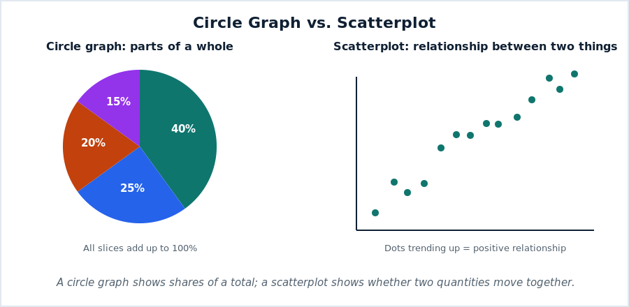
In the circle graph above, the largest slice is 40%, so that category is the biggest share of the whole. Because the slices must total 100%, you can sometimes find a missing slice by subtracting the others from 100.
Scatterplots: Do Two Things Move Together?
A scatterplot places a dot for each pair of measurements — for example, a student’s study time and their test score. The pattern of the dots tells you about the relationship. If the dots rise from left to right, the two things tend to increase together (a positive relationship). If they fall, one goes up as the other goes down (a negative relationship). If the dots are scattered with no direction, there is little or no relationship.
In the scatterplot above, the dots rise to the right, so the two quantities have a positive relationship. Remember, though, that a relationship on a scatterplot shows a link, not proof that one thing causes the other.
Matching the Graph to the Question
The quickest way to handle these is to match the graph to the job. Proportions and shares point to a circle graph. A question about whether two measurements are connected points to a scatterplot. If you know that going in, you will read the graph with the right question already in mind.
Watch: A Short Video Lesson
The Magic Of Math walks through this skill clearly in a few minutes. It is a helpful companion to the reading above:
A Routine for These Graphs
- Circle graph: read each slice as a share of 100%; the biggest slice is the biggest share.
- Missing slice? Subtract the known slices from 100%.
- Scatterplot: look at the direction of the dots — up, down, or no pattern.
- Up together is positive; opposite directions is negative; a link is not proof of cause.
Practice
- What do all the slices of a circle graph add up to?
- A circle graph shows 40%, 25%, and 20%. What is the fourth slice?
- On a scatterplot, what does an upward pattern of dots mean?
- Which graph would you use to show what share of a class chose each lunch option?
- Which graph would you use to see if taller people tend to have longer arms?
- Does a positive scatterplot prove that one thing causes the other?
Answers
- 100%.
- 15% (100 minus 40, 25, and 20).
- The two quantities tend to increase together (a positive relationship).
- A circle graph.
- A scatterplot.
- No — it shows a link, not causation.
Where This Fits in Your Science Prep
These join data tables and bar and line graphs to complete your graph toolkit. Put them to work spotting trends and predictions, and connect the scatterplot idea to correlation versus causation. See all topics on the Science Topics Hub.

Related to This Article
More math articles
- Pie Graphs
- Word Problems Involving Money
- TExES Core Subjects Math Worksheets: FREE & Printable
- The Best Grade 7 ELA Practice Tests for Nebraska Students
- Full-Length ACT Math Practice Test-Answers and Explanations
- Party sorting, negative partisanship, and affective polarization
- A Step-by-Step Guide to Constructing a Triangle from Its Sides
- Top 10 4th Grade MCAS Math Practice Questions
- A Comprehensive Collection of FREE SAT Math Practice Tests
- Geometric Distribution Calculator (Free, Step-by-Step)














What people say about "Circle Graphs and Scatterplots"?
No one replied yet.