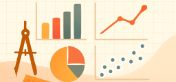
Types of Graphs

We use the statistical chart to display a set of data to make it easier to understand and interpret statistical information.
Related Topics
A step-by-step guide to the types of graphs
There are different types of graphics. The choice depends on the type of data collected and the information you want to transfer. Each has its set of advantages and disadvantages.
The table below summarizes the main types of charts available. The knowledge of each of them is essential for the correct reading of the information contained in them.
Bar graph
Bar charts are a way to display qualitative data visually. The data is displayed horizontally or vertically, allowing viewers to compare items such as values, characteristics, times, and frequency.
The bars are arranged in order of frequency, so more important categories are emphasized. By looking at all the bars, it is easy to identify which category dominates the others in one set of data. Bar charts can be single, stacked, or grouped.

Pie chart
Another common way to display data graphically is a pie chart. It takes its name from its appearance, just like a circular pie cut into several slices. This type of chart is useful when charting qualitative data, where the information describes a trait or attribute and is not numerical.
Each slice of pie represents a different category, and each trait corresponds to a different slice of pie. Some slices are usually significantly larger than others. By looking at all the pie pieces, you can compare how much data fits into each category.
Histogram
A histogram is another type of chart that uses bars for its display. This type of chart is used with quantitative data. The ranges of values, called classes, are listed at the bottom, and classes with higher frequencies have longer bars.
A histogram often looks like a bar chart, but varies due to the measurement level of the data. Bar graphs measure the frequency of classified data.
A categorical variable has two or more categories, like gender or hair color. In contrast, histograms are used for data that contains ordinal variables or things that are not easily measurable, such as emotions or opinions.
Stem and leaf plots
The stem and leaf plot divides each value of the quantitative data set into two parts: a stem, usually for the highest place value, and a leaf for the other place values. This provides a way to list all data values concisely.
Dot plot
A dot plot is a combination of a histogram and a stem and leaf plot. Each quantitative data value becomes a dot or point that is placed above the appropriate class values.
Where histograms use rectangles or bars, these graphs use dots that are then connected by a simple line.
Dot plots are a good way to compare how long it takes for a group of six or seven to have breakfast, or to show the percentage of people in different countries who have access to electricity.
Scatter plots
A scatter plot shows data paired using a horizontal axis (\(x\)-axis) and a vertical axis (\(y\)-axis). The statistical tools of correlation and regression are used to show the trends in the scatter plot.
The scatter plot usually looks like a line or curve moving up or down from left to right along the graph, with points “scattered” along the line. The scatter plot helps you discover more information about each dataset, including:
- The general trend between variables
- Outliers from the overall trend
- The shape of any trend
- The strength of any trend
Time-Series graphs
The time-series graph shows data at different time points, so it is another type of graph used for certain types of paired data. As the name implies, this type of chart measures trends over time, but the time interval can be minutes, hours, days, months, years, decades, or centuries.
Exponential graphs
Exponential graphs are the representation of exponential functions using the table of values and plotting the points on graph paper. The exponential functions are the inverse of logarithmic functions. In the case of exponential graphs, the graph can be a type of incremental or decremental curve based on the function.
Logarithmic graphs
Logarithmic functions are the inverse of exponential functions, and their drawing method is similar. To draw logarithmic graphs, you need to make a table of values and then draw points accordingly on graph paper.
Trigonometric graphs
The trigonometric diagrams include the sine function, cosine function, tangent function, cotangent function, cosec function, and secant function.
Frequency distribution graph
To show the frequency of results in a particular sample, use frequency distribution graphs. For frequency distribution diagrams, a table of values is created by placing the results in one column and the number of times they appear (ie, the frequency) in the other column.
This table is known as the frequency distribution table from which the cumulative frequency graph can be drawn.

Related to This Article
More math articles
- 8th Grade WVGSA Math Worksheets: FREE & Printable
- FREE 3rd Grade SBAC Math Practice Test
- The Best Grade 5 ELA Practice Tests for Illinois Students
- The Best Grade 7 Math Book for Minnesota Students
- Smarter Balanced Grade 8 Math Free Worksheets: 72 Printable Standards-Aligned PDFs with Answer Keys
- 10 Most Common 4th Grade NYSE Math Questions
- How to Determine if (X, Y) is a Solution to a System of Equations
- Accuplacer Math Formulas
- Choosing Bitcoin Casino Games: Dice, Slots, Live Dealer and What Fits Different Session Goals
- How to Identify Statistical Questions


What people say about "Types of Graphs - Effortless Math"?
No one replied yet.