Grade 6 Math: Dot Plots
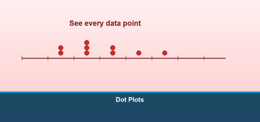
Grade 6 focus: A dot plot (number line plot) shows each data value as a dot above a number line. Repeated values stack vertically. Dot plots make shape, center, and spread easy to see for small to medium data sets.
Video lesson: Watch this Math with Mr. J tutorial on how to make and read a dot plot.
How to build one
- Draw a number line that covers the data range.
- For each value, place a dot above its position.
- If a value repeats, stack dots.
- Title the display and label the axis with units if applicable.
What to look for
- Clusters—where data pile up.
- Gaps—regions with no data.
- Outliers—values separated from the main cluster (informal language in Grade 6).
Dot plot vs. histogram
Dot plots show every value; histograms group values into bins. Dot plots work well when you want to preserve individual data points.
Common mistakes
- Using uneven spacing on the number line.
- Forgetting to stack dots for duplicates.
- Choosing a range that cuts off important values.
Fluency check
Given heights of plants in inches, plot each height on a dot plot and describe one feature of the distribution in a sentence.
Understanding Dot Plots
A dot plot is a simple visual representation of data where each data point is shown as a dot above a number line. Dot plots are especially useful for displaying small data sets and identifying patterns, clusters, and outliers at a glance.
Definition of a Dot Plot
A dot plot displays quantitative data on a horizontal axis. Each dot represents one occurrence of a value. Dots are stacked vertically when multiple data points share the same value. Dot plots preserve individual data points (unlike histograms), making them ideal for detailed analysis.
How to Create a Dot Plot from Data
Step 1: Collect and Organize Data List all data values. Example: heights of students: 58, 60, 60, 62, 60, 64, 62, 58, 60
Step 2: Identify the Range Find minimum (58) and maximum (64) values. This determines the number line scale.
Step 3: Draw the Number Line Draw a horizontal axis labeled with the variable (Height in inches) with tick marks from the minimum to maximum.
Step 4: Place the Dots For each data value, place a dot above the corresponding number. Stack dots vertically if a value appears multiple times.
Step 5: Add a Title Title your dot plot clearly (Student Heights in Inches).
Example Dot Plot
For the height data above:
58: •• (2 students)
60: •••• (4 students)
62: •• (2 students)
64: • (1 student)
Reading and Interpreting Dot Plots
Finding the Mode: The mode is the value with the most dots. In the height example, the mode is 60 inches (4 students).
Finding the Range: Range = maximum – minimum = 64 – 58 = 6 inches.
Identifying Patterns: Look for clusters (where dots bunch together) and gaps (areas with no dots). The heights cluster around 60 inches with a gap at 63.
Spotting Outliers: Values far from the main cluster. No clear outliers here, but if a student were 50 inches, that would be an outlier.
Comparing Distributions with Dot Plots
Dot plots excel at comparing two data sets side by side. Draw one dot plot above another using the same scale to compare centers, spreads, and shapes.
Worked Example: Compare boys’ and girls’ heights in a class.
Boys’ Heights (inches): 60, 62, 62, 64, 64, 64, 66
Girls’ Heights (inches): 56, 58, 58, 60, 60, 62
Observations:
– Boys’ heights cluster higher (62-64 range)
– Girls’ heights cluster lower (58-60 range)
– Boys’ data is more spread out (56-66 vs 56-62)
– Both distributions have gaps at odd numbers
Advantages of Dot Plots
Preserves Individual Data Points: Unlike histograms, you can see each data value.
Easy to Construct: No complex calculations needed.
Clear Visualization: Patterns, clusters, and outliers are visually obvious.
Suitable for Small Data Sets: Works best with 10-50 data points.
Frequently Asked Questions
Q: What’s the difference between a dot plot and a histogram?
A: A dot plot shows individual data points as dots. A histogram groups data into intervals and shows frequencies as bars. Use dot plots for detailed analysis; use histograms for large data sets.
Q: How many data points is ideal for a dot plot?
A: Dot plots work best with 10-40 points. Fewer than 10 may not show patterns; more than 50 becomes cluttered.
Q: Can I make a dot plot for non-numeric data?
A: No, dot plots require numeric (quantitative) data. For categories (colors, names), use a bar chart instead.
Q: How do I handle repeated values in a dot plot?
A: Stack dots vertically. If 5 students scored 85, place 5 dots stacked above 85 on the number line.
Learn more about representing data with Line Plot and How to Solve the Frequency Distribution Table.
Understanding Dot Plots and Their Uses
A dot plot is a simple yet powerful visual representation of quantitative data. In a dot plot, each data point is represented as a dot positioned above a number line. Dot plots are especially useful for displaying small to medium data sets and for identifying patterns, clusters, gaps, and outliers at a glance without losing individual data point information.
Definition and Structure of Dot Plots
A dot plot displays quantitative data on a horizontal axis (number line). Each dot represents one occurrence of a value. When multiple data points share the same value, dots are stacked vertically above that value. This design preserves individual data points while making frequency obvious through visual height, making dot plots ideal for detailed statistical analysis.
Step-by-Step Process for Creating a Dot Plot
Step 1: Collect and Organize Data List all data values you’ll be plotting. Example: heights of students in inches: 58, 60, 60, 62, 60, 64, 62, 58, 60
Step 2: Identify the Range Find the minimum value (smallest) and maximum value (largest). This determines the scale needed for your number line. Example: minimum = 58 inches, maximum = 64 inches.
Step 3: Draw the Number Line Draw a horizontal axis with appropriate scale. Label it clearly with the variable being measured (Height in inches). Include tick marks at reasonable intervals to cover from minimum to maximum. Make sure intervals are evenly spaced.
Step 4: Place the Dots Above Values For each data value, place a dot above the corresponding number on the line. When a value appears multiple times, stack dots vertically directly above that number. Be precise in alignment.
Step 5: Add Title and Labels Give your dot plot a descriptive title (Student Heights in Inches) and ensure axes are labeled. This makes your plot interpretable to others.
Example Dot Plot Construction
Using the height data: 58, 60, 60, 62, 60, 64, 62, 58, 60
58: •• (2 students at 58 inches)
60: •••• (4 students at 60 inches) ← mode
62: •• (2 students at 62 inches)
64: • (1 student at 64 inches)
Total: 9 students represented
Reading and Interpreting Dot Plots
Finding the Mode (Most Common Value): The mode is the value with the tallest stack of dots. In the height example, the mode is 60 inches because 4 students have that height, more than any other value.
Finding the Range (Spread of Data): Range = maximum – minimum = 64 – 58 = 6 inches. This tells us the spread from smallest to largest value in our data set.
Identifying Clusters (Where Data Groups): Look for areas where dots bunch together. In our example, most heights cluster around 60 inches (4 dots) with the next cluster at 62 (2 dots). This indicates the typical height for the group.
Spotting Gaps (Where No Data Exists): Notice areas on the number line with no dots. Our example has a gap at 63 inches—no students have exactly that height. Gaps indicate values that don’t appear in the data set.
Finding Outliers (Unusual Values): Values far from the main cluster that stand alone. No clear outliers in this example, but if a student were 50 inches tall, that would be an outlier—much smaller than the cluster around 60-62.
Comparing Distributions Using Parallel Dot Plots
Dot plots excel at comparing two data sets side by side. Draw one dot plot above another, using the exact same scale on both axes to ensure fair comparison. This allows you to visually compare centers, spreads, and overall distributions.
Complete Comparison Example: Compare boys’ and girls’ heights in a mixed class
Boys’ Heights (inches): 60, 62, 62, 64, 64, 64, 66
Girls’ Heights (inches): 56, 58, 58, 60, 60, 62
Detailed Observations:
– Boys’ heights cluster in the higher range (62-64), girls’ cluster lower (58-60). This shows a systematic difference between the two groups.
– Boys’ data spreads from 60-66 (range of 6), girls’ data spreads from 56-62 (range of 6), same spread but different location.
– Both distributions have gaps at odd numbers (no one is exactly 61, 63, or 65 inches)
– The typical (median) height for boys (~63) is higher than for girls (~59)
Key Advantages of Using Dot Plots
Preserves Individual Data Points: Unlike histograms that group data into intervals, you can see each original data value and count exact frequencies.
Easy to Construct: No complex calculations needed. Anyone can create one by hand with just a number line and dots.
Clear Visual Display: Patterns, clusters, and outliers become visually obvious. The distribution shape is immediately apparent.
Ideal Size for Certain Data Sets: Works best with 10-50 data points. Fewer than 10 may not show clear patterns; more than 50 becomes cluttered.
Frequently Asked Questions About Dot Plots
Q: What’s the fundamental difference between a dot plot and a histogram? A: A dot plot shows individual data points as separate dots. A histogram groups data into intervals (bins) and shows frequencies as connected bars. Use dot plots for detailed analysis; use histograms for large data sets where preserving individual points isn’t practical.
Q: How many data points is ideal for a dot plot versus other displays? A: Dot plots work best with 10-40 points. Fewer than 10 may not show clear patterns; more than 50 becomes visually cluttered and hard to read.
Q: Can I make a dot plot for non-numeric data like colors or categories? A: No, dot plots require numeric (quantitative) data. For categorical data (colors, names, categories), use a bar chart or frequency table instead.
Q: How do I handle repeated values in a dot plot? A: Stack dots vertically directly above the number. If 5 students scored 85 on a test, place 5 dots stacked above 85 on the number line.
Learn more about representing data with Line Plot and How to Solve the Frequency Distribution Table.

Related to This Article
More math articles
- TASC Math Flashcards (Free Online: Formulas, Terms & Concepts)
- Grade 2 English Worksheets for Utah Students — Free PDFs
- How to Distance Teach Math with a Drawing Pad?
- Cramer’s Rule Calculator (2×2 and 3×3 Systems, Free)
- Full-Length DAT Quantitative Reasoning Practice Test-Answers and Explanations
- Full-Length 6th Grade PSSA Math Practice Test
- How to Solve Logarithmic Equations? (+FREE Worksheet!)
- A Deep Dive into the Integral Test
- Doubling Down: When the EV Curve Bends Toward You
- Full-Length 6th Grade STAAR Math Practice Test


What people say about "Grade 6 Math: Dot Plots - Effortless Math"?
No one replied yet.