Graphing Histograms
In this article, we want to know what a histogram is and how to graph a histogram.

Graphing Histograms: what to notice and how to work it
What to notice first
Common student mistake
Key formulas and cues
A reliable path
- Identify the questionDecide whether you need center, spread, shape, or association.
- Use the right displayChoose a histogram, box plot, scatter plot, or summary statistic.
- Write the meaningExplain what the statistic says about the data set.
Worked examples
Find IQR
- IQR measures the middle 50%.
- Subtract Q1 from Q3.
- 20 – 8 = 12.
Read association
- As x increases, y tends to increase.
- That is a positive association.
- A best-fit line should have positive slope.
Try one before moving on
Graphing Histograms: pop-up practice
What’s Histogram?
Histograms are the graphical interpretation of information where information is grouped into constant amount ranges and each of those ranges relates to a vertical bar.
- A horizontal axis shows the number range.
- A vertical axis (frequency) signifies the quantity of information available for each range.
The number ranges are dependent upon the information being utilized. So, here’s more info regarding histograms.
Related Topics
How do you create histograms?
The method of creating histograms utilizing the provided info is shown here:
- Step one: Pick an appropriate scale to designate weights on a horizontal axis.
- Step two: Pick an appropriate scale to designate the frequencies on a vertical axis.
- Step three: After that, make the bars consistent with each of these given weights via utilizing their occurrences.
Hints and Techniques on Histograms
Here are several quite vital hints and techniques you should remember whilst envision any information via histograms.
- Pick the scale for the vertical axis whilst creating a histogram, make sure to check for the uppermost number that separates all frequencies. If there’s no such number existing, after that check for the utmost number which separates the majority of frequencies.
- Histograms are graphs utilized to summarize constant information.
- A histogram gives the visual interpretation of continuous data.
- Scales of both the horizontal and vertical axes do not have to begin with zero.
- There ought not to be any gaps in-between the bars of histograms.
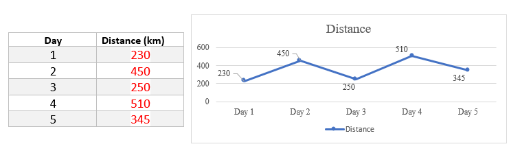
Histograms – Example 1:
Use the following Graph to complete the table.
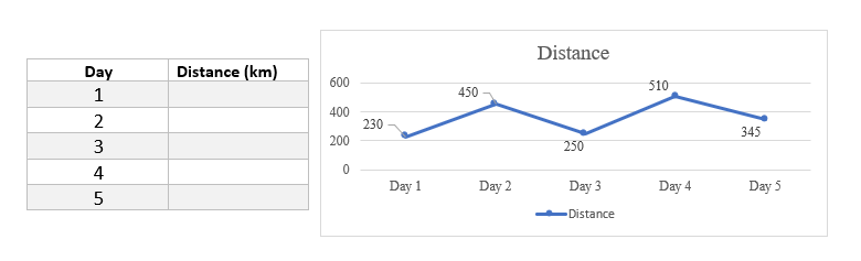
Solution:
The graph you see above is a histogram. This chart gives you a brief overview of the distance traveled over different days. The horizontal axis represents the days traveled and the vertical axis represents the distance. The points marked on the graph indicate the distance traveled in each day, according to which you can complete the relevant table.

Related to This Article
More math articles
- 10 Most Common 5th Grade ACT Aspire Math Questions
- 5th Grade PSSA Math FREE Sample Practice Questions
- Grade 3 Math: Area
- Free Grade 8 English Worksheets for Colorado Students
- Free Grade 6 English Worksheets for Colorado Students
- Subtracting Decimals for 5th Grade: Regrouping and Practice
- Top 10 Tips to Create a CLEP College Mathematics Study Plan
- 8th Grade Math: The Complete Parent’s Guide for 2026
- Classifying Quadrilaterals for 4th Grade
- How to Determine Limits Using Algebraic Manipulation?


What people say about "Graphing Histograms - Effortless Math"?
No one replied yet.